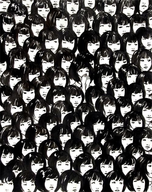
bodies,ink on paper and digital
it’s funny how renaissance paintings frequently have an incredible number of figures in the composition. i can’t imagine how artists approached designing these images– there are so many variables per figure. just thinking about how many choices one has to make per square inch gives me anxiety. i would never be able to leave the thumbnail stage– i’d just make minuscule edits until i drop dead.
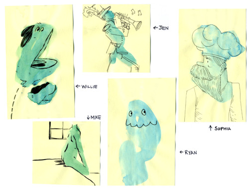
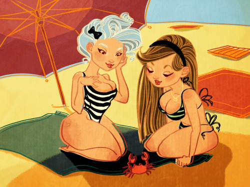
this drawing is a product of no planning. i don’t think there’s any other way i can put more than two figures in an illustration. it seemed better to do something (even if it’s a bad design) than to do nothing at all.
i also think it’s a little disturbing how illustration follows fashion trends so closely. maybe it’s even larger– the public’s “taste” (as in color preferences) copies fashion seamlessly. it’s like we’re all pilot fish living off the gills of the runway. i’ve come to this realization b/c several times in the past 10 or so years, i’ve found that i have very strong opinions on palettes. i’d wonder how i arrived at that conclusion…then i look at everyone’s clothes.
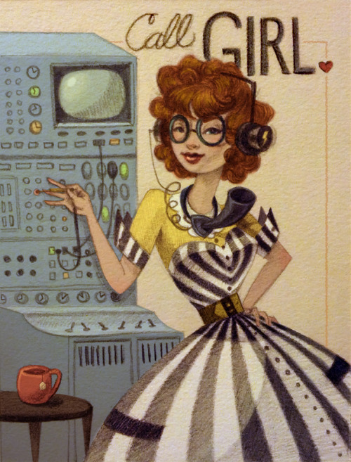
why did artists love brown with cyan accents from 2006-2007? b/c it was on every rack in north america. why are so many people in love with a narrow value range, warm shadows, and exaggerated colors (ala instagram)? b/c vintage is in style. why does this drawing have bright neon stripes on it? well the answer is in the Gap’s spring 2012 catalogue.
sometimes i wish i had my own, self-contained, opinion about color. but like perception of color, taste in color is relative to everything around it.
who is controlling my preferences? who is controlling theirs? i wonder if anna wintour is partially to blame…
